PULSE
PULSE
IN THE KNOW
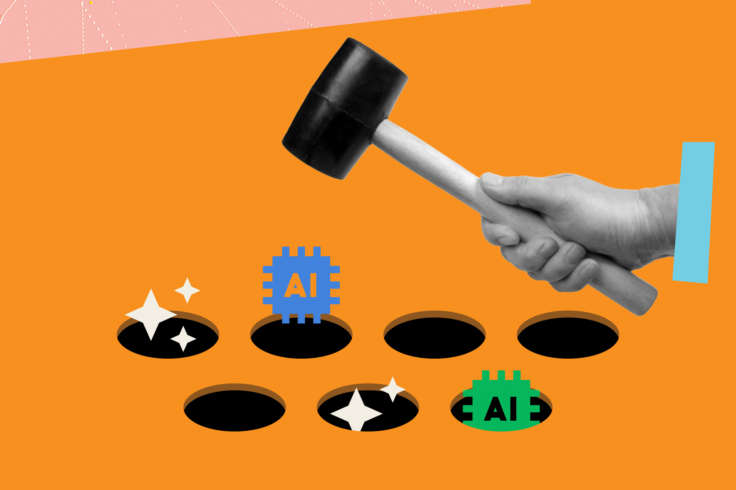
How Not to Roll Out Your New AI Feature
MARCH 2026
You’ve seen the trend: whether B2B or B2C, nearly every major app has added AI features in the past year. Amazon has Rufus. Google Meet has Gemini notes. Redfin has AI search. The list goes on.
And yet, few are doing it well. Here are three common mistakes we see when AI features are introduced into existing products and the reasons people ship bad products.
Why Are There So Many Bad AI Features?
These missteps aren’t happening because teams don’t recognize the issues. They do. The problem is a mix of external pressure and flawed assumptions.
1. The AI arms race
There’s intense pressure to ship AI features quickly. We’re generally proponents of MVPs—but AI changes the equation.
A traditional MVP can succeed because you prioritize primary features and deprioritize secondary functionality. An AI feature cannot, however, be considered MVP when the quality is partly there. If the output isn’t good, the feature isn’t viable.
2. “It will improve over time”
Teams often assume the AI will get better through usage. That may be true—but it’s not a strategy.
User interaction can refine a system, but it shouldn’t be the primary mechanism for making it usable. A baseline quality bar needs to be met before release.
3. Pressure to drive revenue
AI has become a monetization lever.
In enterprise software, it justifies higher subscription tiers (e.g., productivity gains in tools like QuickBooks or Slack) or usage-based pricing (like Figma credits). In consumer products, it’s often used to nudge purchasing decisions in the hopes of increasing conversion (Like asking Rufus if a pair of kids sneakers are washable or if a bookshelf is easy to assemble).
That pressure can push features out the door before they’re ready.
The Problems (with Real-world Examples)
1. It ships before it’s ready
This should be obvious: don’t launch an AI feature—even in beta—if the output quality isn’t there.
Quality is the product. If the AI doesn’t understand users or improve on existing functionality, it doesn’t add value—it erodes trust.
And marking a feature as “beta” does not excuse poor quality. In products like JIRA that are aimed at users in tech, users may tolerate rough edges based on a beta label. But in most consumer or mainstream tools, users will not significantly lower their expectations based on a beta label; they will assume, fairly, that if a feature is live it is good-to be used.
Case in point: Redfin’s AI search
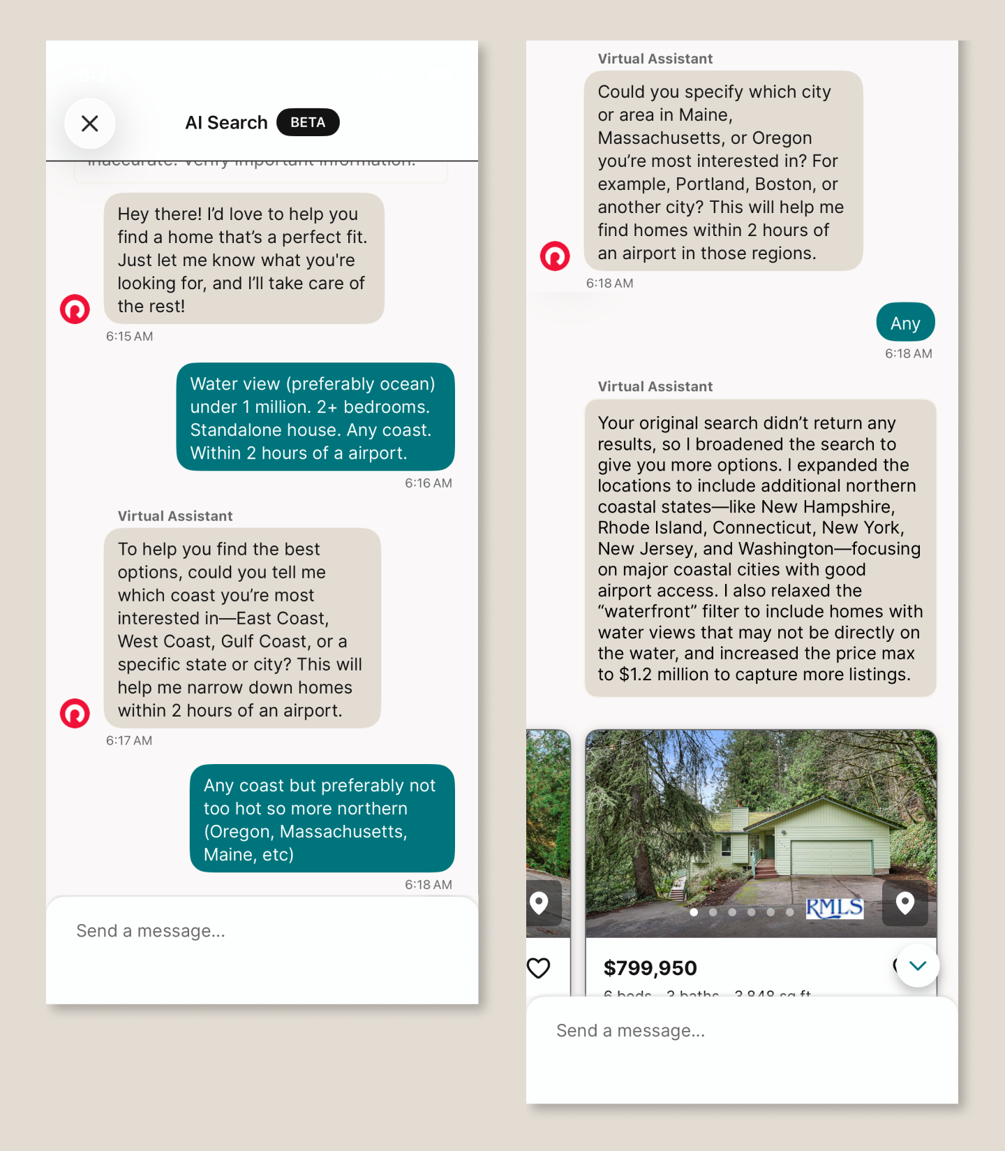
Redfin’s traditional search relies on structured filters—especially location—which works well for many buyers. But it falls short on fuzzier needs: comparing non-contiguous neighborhoods, needing a fenced backyard for a dog, or describing preferences like “light” or “open floor plan.”
AI should help here. Instead, the experience breaks down:
It ignores the prompt: Prompted to search “any coast,” it repeatedly asks which coast.
It invents constraints: It “relaxes the waterfront filter” when no such filter was requested. (I had requested a water view.)
It misinterprets intent: A request for homes within two hours of a major airport returns results in cities with major airports
The result isn’t just unhelpful–it undermines confidence in the product.
2. It’s over-promoted (and becomes annoying)
You want users to discover the feature. You may even want to shift behavior. But overdoing it backfires.
Repeated pop-ups, forced exposure, or turning features on by default will, at best, irritate users—and at worst, disrupt them.
Case in point: Google Meet’s “Ask Gemini”
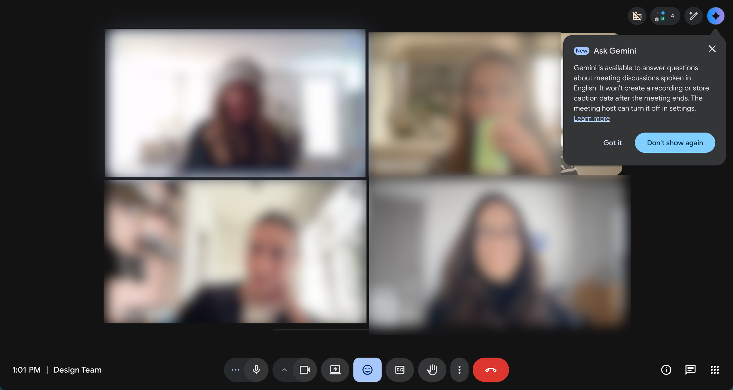
When the feature launched, it appeared repeatedly across meetings—even after being dismissed. Within days, it had shown up half a dozen times.
The result: annoyance, not adoption. And notably, no clear understanding of what the feature actually did.
If you use interruptions to announce a feature:
Show them sparingly (2–3 times max)
Space them out
Avoid interrupting task-focused moments
This matters even more in tools like Google Meet, where users are trying to stay focused.
Related example: Otter.ai
Otter automatically posts a “meeting ending soon” message in a meeting chat 5 minutes before the meeting ends—even when the meeting organizer didn’t invite the tool. It’s distracting to the organizer and pulls attention at exactly the wrong moment.
3. It’s turned on by default
After investing heavily in a feature, it’s tempting to force adoption. Don’t.
AI should enhance productivity—not compete for attention. Users should choose when and how to engage with it.
Case in point: Adobe Acrobat’s PDF Summary
Auto-invoked summaries often interrupt simple workflows. For many users, it’s faster to skim a document themselves than to engage with an unnecessary AI layer. Most PDF documents I open are short and what I need is easy to find thanks to headers—and the human brain’s amazing ability to scan. And yet, Adobe keeps displaying AI summaries. My reaction: what a waste of resources. When AI appears uninvited, it feels like friction, not help.
The Bottom Line
AI adoption is accelerating. Many users are already comfortable with tools like ChatGPT or Copilot, and their expectations are rising just as quickly.
Set a high bar:
The feature should do something meaningfully new
The output should be reliable and useful
The experience should feel like an upgrade, not an interruption
Most of all, be user-centric. AI may change the interface, but it doesn't change the fundamentals—understanding users, defining real needs, and innovating solutions.
If your product is evolving with AI and you're not sure the experience is keeping up, that's worth a conversation. Functionaire helps teams design AI-powered products that actually work for the people using them. Let's talk.

TEAM MEMBER SPOTLIGHT
Gabie Buechner, UX Design & Marketing
JANUARY 2026
Did you know Gabie lives in New York City? She’s a member at the Brooklyn Botanical Garden and loves a good slice (Upside Sourdough Pizza is her top pick). In her free time, she enjoys drawing, composing on the piano, and playing cards. She also recently got her sailing license and can captain up to a 50ft sail boat!

IN THE KNOW
Why Your AI Product isn’t Getting Adopted (and it’s not the algorithm)
JANUARY 2026
Most AI products fail not because of poor technology, but because of poor user experience. When users can't understand what your AI is doing or why, trust evaporates.
📌 𝐎𝐯𝐞𝐫𝐩𝐫𝐨𝐦𝐢𝐬𝐢𝐧𝐠 𝐖𝐡𝐚𝐭 𝐀𝐈 𝐂𝐚𝐧 𝐃𝐨: Setting unrealistic expectations that lead to disappointment
📌 𝐂𝐨𝐦𝐩𝐥𝐞𝐱𝐢𝐭𝐲 𝐖𝐢𝐭𝐡𝐨𝐮𝐭 𝐒𝐜𝐚𝐟𝐟𝐨𝐥𝐝𝐢𝐧𝐠: Overwhelming users with advanced features before they understand basics
📌 𝐓𝐡𝐞 𝐈𝐧𝐜𝐨𝐧𝐬𝐢𝐬𝐭𝐞𝐧𝐜𝐲 𝐓𝐫𝐚𝐩: Unpredictable AI behavior that erodes trust
📌 𝐓𝐡𝐞 𝐁𝐥𝐚𝐜𝐤 𝐁𝐨𝐱 𝐏𝐫𝐨𝐛𝐥𝐞𝐦: Lack of transparency in how AI makes decisions
𝐈𝐬 𝐲𝐨𝐮𝐫 𝐀𝐈 𝐩𝐫𝐨𝐝𝐮𝐜𝐭 𝐬𝐭𝐫𝐮𝐠𝐠𝐥𝐢𝐧𝐠 𝐰𝐢𝐭𝐡 𝐚𝐝𝐨𝐩𝐭𝐢𝐨𝐧? Let's talk about bridging the gap between innovation and usability. Learn how we help teams design intuitive AI experiences.
GET TO KNOW OUR GUESTS
Q&A with Emily Grayson
DECEMBER 2025
Emily Grayson is the VP of Operations and Chief of Staff, at Tuckernuck — a brand that has redefined what it means to blend timeless style with modern retail. Tuckernuck recently earned a spot on Inc.’s list of fastest-growing companies. They’ve done it by staying true to their vision, building a fiercely loyal customer base, and proving that women-led businesses can scale with both heart and strategy.
Can you share a moment when you deliberately didn’t follow a common retail playbook — and it turned out to be the right call for Tuckernuck?
When our founders first pitched Tuckernuck’s business idea to a room full of investors, the immediate advice we received was to build out a technology team. At the time, that was the conventional wisdom — invest in tech, scale fast, and follow the “bricks-to-clicks” trend. Instead, we took a different path...

IN THE KNOW
6 Ways to Keep Fresh as a UX Designer
OCTOBER 2025
Whether you work at a large company on a team that includes UX designers, UI designers, and UX researchers or a small start-up where you wear many hats, you want to stay fresh in your approach. Reading blogs and articles is important, but if you’re designing filters for the 3rd time in as many years or creating a dashboard for the 5th client this year, you may feel like you’ve been-there-done-that. Here are some ways to help you stay inspired and give you a fresh perspective to your work. Best of all: you can try them this week.
Be (dis)loyal to your preferred platform or OS
Watch a usability testing session
Try a new design tool

TEAM MEMBER SPOTLIGHT
Eliana Stein, Co-Founder & Director of Design
OCTOBER 2025
Eliana, our co-founder and Director of Design, in her own words...
☕ Caffeine has no effect on me — I drink coffee and tea morning, noon, and night.
🚲 I didn’t learn to ride a bike until I moved to Madison (over 30 and no regrets!).
🐱 My cat, who attends most of my meetings, has been featured twice on Cats of Madison
IN THE KNOW
If a Picture is Worth a Thousand Words, a Prototype is Worth a Thousand Developer Hours
SEPTEMBER 2025
In just a few weeks, we can create an interactive prototype that’s polished and feels like a real app. These prototypes are invaluable for gathering early feedback from potential customers–before investing in software development.
Watch Eliana Stein walk through one of our prototypes.
A few examples of prototypes we’ve built for clients:
A monogramming feature for e-commerce (desktop and mobile)
A mobile app to practice job interviews
A tablet app to guide doctors in using ultrasound in the ER
Contact us to see one of these prototypes.

TEAM MEMBER SPOTLIGHT
Melanie Balsis, Design
SEPTEMBER 2025
Did you know our senior UI/UX designer and branding expert, Melanie Balsis, is not only passionate about design—but also music? When she's not kayaking, Melanie is behind the 🎹 piano or on percussion. She's performed with jazz bands, dixieland groups, chamber orchestras, concert bands, and city ensembles. Talk about creativity on and off the screen!

IN THE KNOW
AI Scribes for Physicians: The Good, the Bad, and the Ugly
AUGUST 2025
AI-powered medical scribes like InstaNote, Nabla, Tali, Heidi, Commure, and Freed are changing how clinicians document care. By “listening in” on patient-doctor conversations and then writing the notes, they cut down on doctors’ admin time. But are they usable enough for real-world adoption?
We evaluated several tools that are leading the charge. Here are our key takeaways:
✅ What Works
Contextual Onboarding: Guided walkthroughs with medical examples help users trust the AI output.
Effortless Capture & Retrieval: One-click recording and well-organized notes are essential.
Flexible Editing: Support for voice, manual, and AI-assisted edits gives clinicians control.
Built-in Feedback Tools: Quick, in-context reporting options encourage continuous AI improvement.
❌ What Doesn’t
Poorly explained or overly complex template management.
Laggy speech editing.
Overpromising on EHR integration.
Evaluating AI scribes at your organization? Let’s talk usability, adoption, and implementation strategies.

INDUSTRY NEWS
Apple’s New “Liquid Glass” and Highlights from WWDC25
JUNE 2025
It’s June, which means Apple has announced new features at their annual World Wide Developer Conference (aka WWDC). Our top takeaways:
Liquid Glass: The big news this year is an overhaul of the visual language for their operating systems. They’ve named the new look "Liquid Glass" and we are not fans. Aesthetically, we think it is overly fussy (google "specular highlight") and usability-wise, we worry that the transparencies and layering will require more cognitive load. (FYI: There are accessibility tools to reduce these effects).
Customization: Apple is leaning hard into customizability. Examples include more options for tinted modes for the iPhone, new layout choices for Car Play, and adjustable windows on iPad.
OS Unification: They are making steps to further unify iOS and MacOS. In addition to OS Tahoe adopting Liquid Glass, Mac computers will now support Live Activities, have a Phone app, iPhone mirroring, etc.
Apple’s AI: Apple is opening their on-device LLM Apple Intelligence to developers.
Photos App: You know how everyone hates iOS18 Photos because it is impossible to navigate? Good news, the latest seems to be an improvement.
Icon Composer: For our fellow designers, Apple has released Icon Composer, an app to help create app icons with liquid glass properties.

TEAM MEMBER SPOTLIGHT
Tim Gill, SEO
MAY 2025
Tim, our SEO expert, met his wife in a capoeira club on the University of Wisconsin-Madison campus - says “our first conversation was halfway between a spin kick and a samba”. He’s passionate about languages and has studied French, Spanish, Portuguese, and Italian (with a dream of someday mixing them all into a career in marketing). Bonus point: any guesses at where this photo is taken?
Newsletter Sign Up
Join our list to receive news, inspiration, and updates in Functionaire’s quarterly newsletter.